


As a designer, I’ve had my fair share of moments where I’ve been tempted to throw every cool idea I’ve ever had into a project. It’s easy to get caught up in the excitement of creating something new, but over the years, I’ve learnt that design is as much about what you leave out as what you put in.
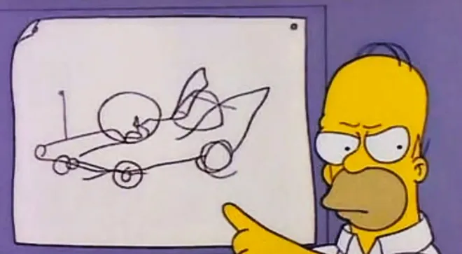
One of the most vivid reminders of this came from an unexpected source: an old episode of The Simpsons featuring the now-infamous car, "The Homer."

The Cautionary Tale of "The Homer"
If you’re a fan of The Simpsons (or even if you’re not), you might recall the episode where Homer Simpson is given the chance to design his dream car. Freed from any constraints, he dives headfirst into the project, determined to create the ultimate vehicle. The result? A chaotic mess of a car with two bubble domes, tailfins, and even multiple horns that play "La Cucaracha." It’s a classic example of what happens when enthusiasm overrides good design principles.
Watching that episode, I couldn’t help but chuckle—partly because it’s hilarious, and partly because I’ve been there. I’ve had those moments where I thought, "Wouldn’t it be cool if we added this feature?" without stopping to think about how it fits into the bigger picture.
1. Avoid Feature Creep: Stick to What Matters
I remember one project early in my career where the client wanted to include every trendy feature on their website: parallax scrolling, animated icons, video backgrounds—you name it. At first, it seemed like a great way to showcase my skills. But as the site came together, it quickly became clear that all those features were working against each other. Instead of a sleek, modern website, we ended up with a cluttered mess that confused users more than it impressed them.
That’s when I learnt the hard way about the dangers of "feature creep." Just because something is possible doesn’t mean it’s a good idea. The key is to focus on the features that truly matter—the ones that align with your brand’s goals and enhance the user experience.
- Lesson: Resist the urge to add every bell and whistle. Instead, prioritise the features that genuinely serve your brand and audience.
2. Consistent Visual Identity: Design with a Unified Vision
In another project, I worked with a startup that was struggling to find its visual identity. The founder loved bold, bright colours, while the marketing team wanted a more subdued, professional look. They kept changing their minds about the colour scheme, the fonts, and even the logo. The result? A brand that felt disjointed and confusing. It reminded me of "The Homer" with its mismatched design elements that didn’t seem to belong together.
That experience taught me the importance of consistency in design. Whether it’s a website, a logo, or an entire brand identity, every element should work together to create a cohesive whole.
- Lesson: Develop a clear style guide and stick to it. Consistency in colour, typography, and imagery is crucial to building a recognisable and trustworthy brand.
3. User Experience: Don’t Confuse Your Audience
One of my favourite parts of designing is getting feedback from real users. But early on, I didn’t always take that feedback as seriously as I should have. I once designed a site that I thought was incredibly intuitive—until I watched users struggle to navigate it. The buttons were in odd places, the layout wasn’t as clear as I thought, and the site map was a maze. It was a humbling experience, to say the least.
It made me think of "The Homer" again. Homer designed the car with himself in mind, not the average motorist. In the same way, I had designed that website based on what I thought was cool, rather than what would be easiest for the user.
- Lesson: Always design with the end-user in mind. Their experience should be smooth, intuitive, and frustration-free.
4. Strategic Restraint: Less is More
There’s a saying in design that I’ve come to live by: "Less is more." It’s tempting to showcase everything you can do, but restraint often leads to better results. I’ve found that the most effective designs are those that communicate a message clearly and simply. When I look at "The Homer," it’s a reminder of what happens when you try to do too much—it dilutes the message and leaves users (or in this case, motorists) overwhelmed.
- Lesson: Embrace simplicity. Every element in your design should have a purpose, and if it doesn’t, it’s better left out.

Conclusion
Learn from “The Homer”
"The Homer" is a funny, exaggerated example of what can go wrong in design, but it carries a valuable lesson.
As a designer, I’ve learnt that the best results come from a clear vision, strategic restraint, and a focus on the user. By avoiding the pitfalls of inconsistency and overcomplication, you can create a brand and website that are not only visually appealing but also effective in communicating your message.
Remember, design isn’t just about what you can add—it’s about what you can take away to reveal the essence of your brand. So, before you start adding all those extra features, ask yourself: Do they really belong? Or are they just going to turn your brand into "The Homer”?
At Revival Media, We Never Create a “Homer”
At Revival Media, we understand that great design isn’t about cramming in every feature or following every trend. It’s about creating a cohesive, consistent, and compelling brand that resonates with your audience. We specialise in strategic branding and web design that prioritises clarity, user experience, and a unified vision. Our approach ensures that every element of your brand and website works together seamlessly, enhancing your message rather than diluting it.
Whether you’re a startup looking to establish a strong visual identity or an established brand needing a refresh, we’re here to help. Let us show you how strategic design can elevate your brand and set you apart from the competition. With Revival Media, you’ll never have to worry about ending up with a “Homer”—we’re committed to delivering designs that are not only visually stunning but also purposefully crafted to achieve your business goals.

